The first few weeks after the last post I was busy figuring out the ins and outs of tax law and all that jazz with having a company. It was actually pretty interesting but probably not fun enough to go over here. Last week though has been a bit different. As I’m going forward to make A Maze Boss into a full game I’ve been thinking of ways to improve it and the first thing I wanted to nail was the visual style. More specifically, even though I loved the way the platforms floated in the air I wasn’t happy with how the walls below the floor tiles looked and performed.
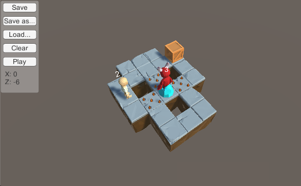
Currently the bottom walls (the brown things) are automatically placed beneath each floor tile with a random rotation, leaving the level creator with no control of where and how to place them in the level. As there is a one to one connection between floor tiles and the walls below them it forced each wall to always have edges at the same depth and height so that they can connect to the wall next to it without having any mismatch and odd visuals. So the narrow width excluded any use of more interesting patterns like bulges or cuts extending over a single tile wall.
Add to that the fact that each wall had four sides even though only one would be visible which would make the game draw an unnecessary amount of extra polygons (also known as overdraw). So I decided to manually place the bottom walls so I could make them bigger and more interesting, though still in separate pieces that could be connected together and also be reused.
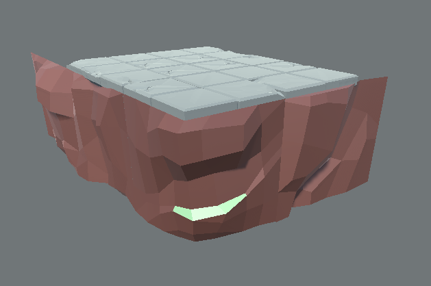
It definitely looks better but you can see the seams between each section. Larger wall pieces would hide this better but that would also force me to make more different pieces as well to cover every possible floor tile combination. Still, I decided to recreate one of the first puzzles with the new walls as well as some new tiles.
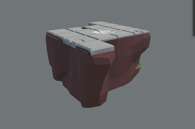
Better, it also helped to add some nice lighting too. Seams are still visible though. I really liked the style though so I wondered how it would look if they were much taller.

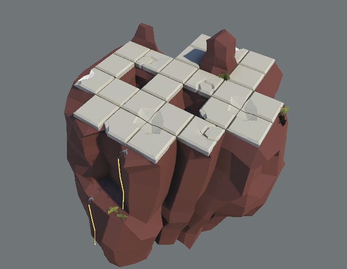
Wow, I really like that! It’s starting to look like the buttes in Arizona. I also added some grass to make it look a bit prettier too. Still, the seams… I wanted to an idea how a level could look without the seams so I made a single connected wall piece for a different level.
This… this is what I want it to look like. It feels much more natural and cohesive. Obviously there are no visible seams as it is a single piece. I changed the camera angle to better fit the actual view it’ll have though that will probably require the bottom walls to be longer.
The climbing gear came in as I started to think more and more about the theme of the game, previously it was about a hero entering some kind of magical dungeon where the inside space was much larger than the outside (so we could have floating platforms) and he would have to fight bosses. It felt a bit cliché and it never really clicked for me.
Seeing the new style I got ideas where the hero is a wanderer in an Arizona style desert and each puzzle level is a butte that he ascends to fight the evil spirits at the top. The game is the same but the theme is different, this lets me do a more brighter and hopefully more beautiful theme where you can see the desert in the background, the sun lighting the plateu and the butte continuing down below.
So my next step is… how can I make this work when having separate pieces? I obviously could make every level by hand as I did above but that would take so much time, I feel like having reusable pieces is still the way to go. My current idea is having edge types where each wall starts and ends with a defined contour so as long as two different walls have a matching edge type (contour) then you can use them together. I believe that in this case seams would be invisible since they are varied and as uneven as the walls themselves.
We’ll see how that works though.